
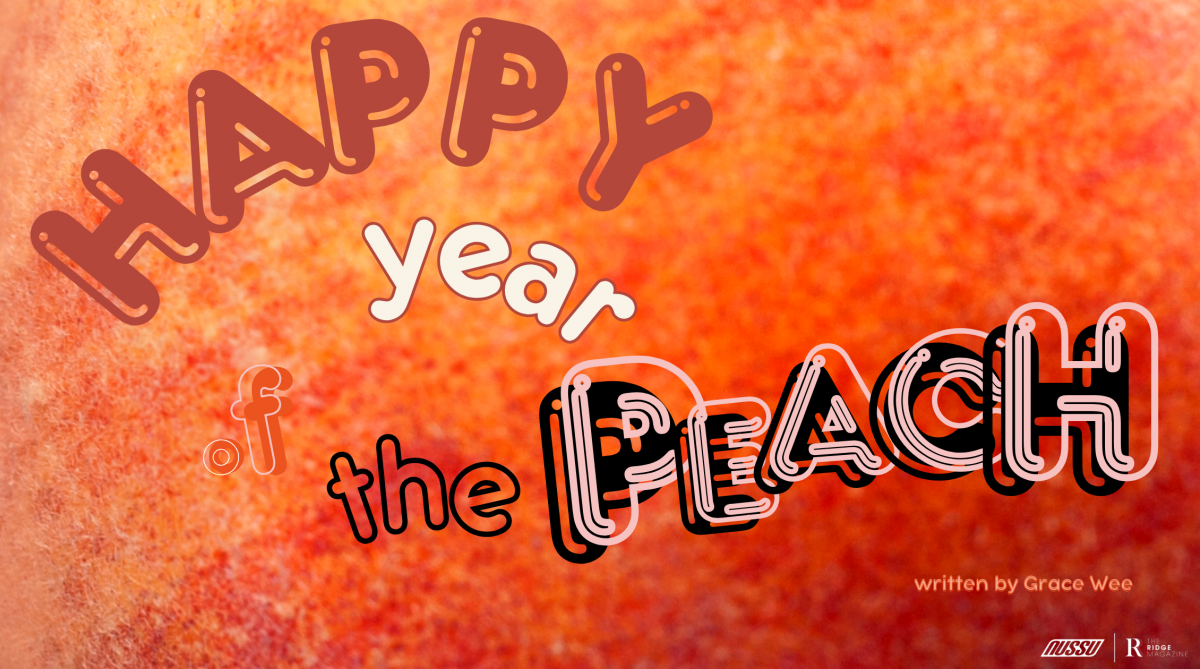
In case you haven’t heard, we are now in the year of Peach Fuzz. Well, at least according to Pantone. Since 1999, Pantone (the American company famous for inventing the Pantone Matching System) has ushered in every new year by declaring a ‘Colour of the Year’ that best represents the current cultural zeitgeist. Apparently, 2024 is the year of peach. Peach is not a straightforward colour to place – rosier than beige, creamier than orange. Even when turning to its edible namesake for clarity, the colour of most run-of-the-mill peaches one might pick up at a supermarket falls closer to the adjacent hue of apricot (unless you happen to reach for the more luxurious Japanese variety that blush much pinker). It is an in-between colour, a rarity in daily life, the kind you only glimpse for brief minutes in the earliest part of a sunset or in the charming colour grading of a Wes Anderson film.
As if to make matters more complicated, Pantone has chosen the name peach fuzz instead of simply peach. What does one make of this, now that an already elusive colour comes with the even more elusive texturisation? Fuzz is lightness, softness, something you can feel but can’t exactly grasp. In Pantone’s official statement, the choice to give peach this specific tactility is deliberate. While peach itself already evokes warmth and comfort, the texture of fuzz emphasises this cosiness. If one could fashion a blanket out of any texture our fingertips could fathom, doesn’t peach fuzz sound like the ideal candidate? Marrying colour with texture, Pantone’s vision for 2024 starts to become clearer. “We feel that at a time like this, tactility is really important — to touch other people and gather them into our homes. We’ve been living in this time of turmoil in many aspects of our lives, and as a result of that, our need for nurturing, empathy, and compassion continues to grow stronger as we imagine a more peaceful future,” a Pantone colour specialist explains. With that, Pantone’s prediction for 2024 is brimming with hope.
It is probably best to part with Pantone’s uplifting vision at this point, while one is still feeling all warm and fuzzy from its forecast. Taking a curious step closer to the whole colour coronation quickly invites a natural follow-up question – well, what was 2023’s colour and how did it fare?
Upon reaching this juncture, I instinctively trawled through a mental run-down of every pop culture milestone I could recall in 2023, racking my brain to find the one colour that recurred time and time again. My first guess was probably the same as many others – pink. The renaissance of pink is undeniably synonymous with the Barbie movie and the gender discourse that boomed upon its release, reinventing the colour so successfully that it stood toe-to-toe with the austere black of its box office twin Oppenheimer. Pink felt rescued from its traditional association with gender roles, now unapologetically embraced rather than made the butt of misogynistic jokes. In the summer of 2023, girlhood was in like never before. The rippling effects of Barbie pink reverberated through numerous online trends such as “girl maths” and “girl dinner” which collectively reclaimed many feminine stereotypes in a good-humoured manner. Just as TikTok was having a field day with these new buzzwords, Taylor Swift (awarded Time Magazine’s Person of the Year) was busy selling out arenas on her Eras Tour, further cementing the inescapable atmosphere of girl power. While the pop star’s signature colour is definitely red, the concept of her tour as a nostalgic celebration of all her past selves resonates more with the youthfulness of pink. Feeling quite satisfied with my bet, I hit a few keys only to find out that 2023’s colour of the year was Viva Magenta.
“Viva Magenta welcomes anyone and everyone with the same verve for life and rebellious spirit. It is a colour that is audacious, full of wit and inclusive of all,” reads the Pantone website against a backsplash of rich red, pink now reduced to almost an imperceptible cool undertone. Obviously, the colour specialists at Pantone do not have the benefit of hindsight when forecasting the new annual colour like we do when evaluating it in retrospect. Still, what good is a prediction if it doesn’t at least get a few things right? At once, my colour-coded rewind of the year restarts. This colour does not jump out with the immediacy of Margot Robbie in her pink Corvette but I find a couple of scattered footholds – Rihanna’s bold catsuit at the Superbowl Halftime (although I concede that the look is not cool-toned enough to classify as magenta), or perhaps the “audacious” colour is reminiscent of the scandalising local extramarital affairs that shook Singapore in the run-up to the presidential election. I squint at the rectangle of Viva Magenta on my laptop, struggling to find a match until I return to the text for more clues. New words float to the forefront – “Viva Magenta is powering and empowering… self-expression without restraint… a stand-out statement…galvanises our spirit, helping us to build inner strength.” As of writing this in December 2023, it is nearly impossible to conceive of this sequence of words, of the indomitable human spirit without thinking of the ongoing genocide in Palestine. Red has historically been associated with both the noble cause of revolutions and the price paid at its expense. Yet, it is not red that is the most impactful colour in the photographs of Palestinian journalists in Gaza. Blood is bright red when it is fresh. But when it has had time to dry; when it has gone cold as civilians perish in overrun hospitals with no running electricity; when it is caked with the grey of rubble, it moults into a haunting shade of magenta. Magenta, splashed across faces so young I wonder if this is their first brush with the colour. In 1937, Picasso’s Guernica paid tribute to a Spanish town that had been air-striked in a canvas of harrowing greys. I wonder why the painter – elsewhere so bold in the way he laid down pigments – did not reach for colour this time, if their addition might have made the painting too painful to bear. At once, the arbitrary turn of the clocks, the ball drops to usher in the new year feels hollow. While the privileged world might move on to peachier times, magenta will continue to spill, staining entire years and generations to come.
In moments like this, Pantone’s 2024 dreamy prediction might feel detached. Perhaps adding insult to injury is the fact that Pantone had used their annual spotlight to raise awareness before – Living Coral in 2019 reflected environmental concerns and a 2022 social media campaign championing the colours of the Ukranian flag. In comparison, Peach might just be too rosy to stomach. (As a side note, some have criticised the problematic equivalence between peachiness with human touch and, by proxy, skin tone. Vogue India notes derisively that the association feels all too reminiscent of white-centricism that has long plagued the make-up scene with limited foundation shade ranges). This far down the rabbit hole, there was the temptation just to throw in the towel altogether and admit that I have read too much into these colours. Yet, circling back to my initial intrigue with Peach Fuzz, I am reminded that I don’t fundamentally disagree with its meaning. Sure, I wished that Pantone had not chosen the marketing visualisers of dandelions, cottontails and shag sofas in a cloud-shrouded penthouse to promote their choice – images that ironically represented how out of touch they were rather than being connected. But, at heart, Peach Fuzz symbolises connection, a soft hearth, a gentle hope. It might feel most out of reach at the moment but perhaps that is how we know it is most sorely needed.
So, I try to banish Pantone’s castles in the sky and reimagine Peach Fuzz in a down-to-earth way, in a way I can actually relate to, as its name demands I do. I think of comfort and home in the closest senses, and that transports me to the world of the mononymous Nguan’s photography. With more than 200,000 followers on Instagram and acclaim from The New York Times Magazine, Singaporean Nguan is popular for his signature colour grading that casts urban spaces in dappled peach light. Despite the uncomplicated mundanity of his subjects, his colour grading seems to make them glow faintly from within – whether he is capturing a vacant HDB corridor, children at a playground, a construction site, the disgruntled uncle at a coffee shop or the crumpled boot of a car as it is being towed away. He captures the absolute banality of life in Singapore, an aesthetic that is more popularly subject to the green-tinted Wong Kar Wai style that characterises the Asian concrete jungle. Instead of leaning in that direction, Nguan’s pastels soften the rough, unpolished edges of the daily humdrum. Unlike Pantone’s Peach Fuzz which feels like a disingenuous pair of rose-tinted glasses, Nguan’s peachiness confronts lived experiences as they are. It’s light because it is free from any lofty ambitions or prayers for a peaceful future. It simply encloses a snapshot of humanity, as naturally as a stray sunbeam, as if to say “Life is pretty beautiful where you’re not looking.” So while Pantone implores for the world to all link arms and get in touch with each other, Nguan’s world of peach humbly suggests that it all begins with looking. Perhaps that is a more realistic goal for us – the quiet vigilance of looking out, the kindness of just noticing.